
Why Muted Colors Are Returning to Businesswear
See how mist blue, taupe and other muted shades affect the look of businesswear across lighting and outfits.
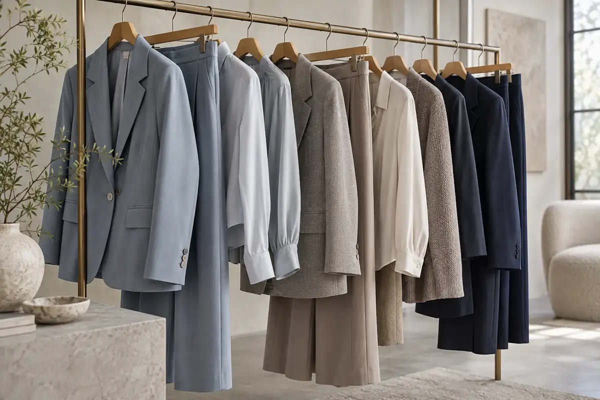
Why the palette works
Mist blue, slate gray, taupe and soft olive offer subtle depth across lighting and combinations. They fit workplaces that call for both ease and professionalism.
Lower contrast reduces visual intensity
Broad areas of muted color can suit open offices, travel and informal meetings without making the outfit feel excessively formal.
Create tonal combinations
Combine mist blue with pale blue, gray-white or navy; pair taupe jackets with beige or charcoal trousers. Related shades increase usable combinations.
Make texture more visible
Twill, small checks and mixed yarns are easier to notice when the color is quiet. Surface character adds interest up close.
Review the colors under different light
A muted shade can look crisp in daylight, soft under warm lighting or grayer on screens. Check samples and images during development.
Provide a range of undertones and values
Blue grays and warmer taupes can work differently against skin tones. Offer distinct lightness and undertone options rather than repeating one gray.
Test in the intended setting
Consider texture, lighting and wearer together. A color that works on one person or in one room may read differently elsewhere.
Check across distance, light and posture
Examine the cloth, wear it and view it in different lighting before choosing the shade.
How muted colors make an impression
They can look restrained from a distance while revealing character up close.
How Architecture Inspires Tailoring, From Rooflines to Jacket Shoulders →
Women's Blazer Proportions: Length, Lapel Width and Button Position →